Pitch leadership for a $20M connected media and web win, followed by discovery and design-system direction. AEM implementation is in progress.
Pitch strategyPitch won
Joined separate media and web briefs around one customer journey and a shared design system.
My roleExperience design pitch lead
The agency won a $20M multi-year engagement; AEM implementation is in progress.
My contribution
Co-wrote the narrative, created the Figma working kit with the team, and presented to Amica leadership.
Team leadership
Assembled a UX, UI, and content pod and aligned media and web teams around one pitch.
Future state. Visual storytelling shows Amica's difference instead of telling it.
Challenge
Amica issued separate media and web RFPs while preparing to modernize a 15-year-old digital experience. We had a small team and a compressed pitch window. The opportunity was to connect acquisition and the website in one story.
My decisions
I put designers and copywriters in one pod and grounded the direction in a competitive audit, market research, and user testing. The team built a mobile-first Figma kit so media and web could develop concepts in parallel. The product-page concepts carried the message from each ad into the landing experience.
I aligned our internal leadership on the value proposition in days instead of weeks. When Amica's brand agency delivered a new identity mid-pitch, I directed the team to extend the kit. We presented high-fidelity screens and a clickable prototype, and I delivered the experience narrative.
Outcome
Amica awarded the agency a $20M multi-year connected media and web engagement. The pitch design system became the modular template system now being implemented in AEM.
01A competitive audit of Amica against seven carriers, ranking discovery, navigation, search, quote flow, support and emotional architecture.02Navigation analysis of five competitors on mobile and desktop.03The redesign had to deliver on three fronts at once, mindset, moment, and conversion.04Organic search test cases. Each query is traced from the search result to the page it lands on.05Usability research on Amica.com and four competitors found that people could not see the value, buried discounts, and long coverage descriptions.06The dynamic product page stage of Melissa's journey, with its data signals, key messages and claims proof point.07The dynamic product page concept pairs each ad with a headline that matches its offer. This connects the media idea to the website experience.08Future state. Visual storytelling shows Amica's difference instead of telling it.09Future state. A conversational tone of voice guides people through each step.10Future state. Content modules surface relevant claims and local coverage early.11The mobile homepage across five states, from a first visit to a returning customer.12Pitch concepts across home, product, quote, and claims, built in one Figma system.13Only 3% of nav clicks go to Get a Quote, while the hero carries 85% of quote entry.
Design systemsAEM implementation in progress
A flexible system for a 700-plus-page redesign, shaped around audience needs and inbound channels.
My roleExperience design director, discovery and design delivery
Reusable templates and components designed for Amica's existing AEM stack.
My contribution
Set direction and led the discovery readout to align stakeholders on the target template, recommended navigation structure, and components to prioritize to extend their existing design system.
Team leadership
Partnered with my UX lead, led executive readouts, and refined recommendations with client stakeholders.
The all-products page design carries the same categories forward to support comparison.
Challenge
Amica needed to serve loyal customers and a new generation of prospects while making its value clear beyond price. The scope included six weeks of discovery and 18 weeks of delivery across nine sprints, with more than 700 pages to redesign.
My decisions
My UX lead and I mapped three audience roles and their journeys. People arrived through product pages, campaigns, search, and educational content, then hit dead ends. Only 2% of Auto Insurance visitors used the related-coverage dropdown, and 14 products had equal weight.
I tied the recommendations to those findings in leadership readouts. The redesign groups the products into five categories and makes coverage pathways more visible. I set direction for templates that adapt by audience and channel, work within AEM, and extend the new brand identity. The system also supplies media teams with shared assets and content references.
Status
The design system and Figma components support the planned website experience. Templates are designed to let marketing teams assemble and publish pages within a shared framework. Implementation in AEM is in progress.
View all project visuals11 slides
01Three principles behind the redesign, with technology and data as the layer underneath.02The vision in one line. From an informational insurance site to a guided commerce experience.03Pathing analysis by product and channel to see how visitors reach quote start, and where they drop.04Same stages for every audience, with different needs at each one.05Only 2% of Auto Insurance visitors used the related-coverage dropdown. The redesign makes those pathways visible.06The redesign groups 14 products into five categories across desktop and mobile, giving people a clearer starting point.07The all-products page design carries the same categories forward to support comparison.08Product subnavigation designed to help people evaluate coverage without hunting across the site.09Homepage variants designed around known signals, including first-time prospects and returning customers.10Reusable building blocks for 700+ pages, built in Figma and now being implemented in AEM.11Product value finding. Clickable and non-clickable mobile elements share the same visual treatment, so people miss the paths that matter.
Search and tribute experiences for a national campaign, plus email production and member-journey systems across cards, banking, and insurance.
Campaign experience designLaunched
Connected remote search, on-site QR entry, and tribute sharing across 39.5M service records.
My roleExperience design lead
281K new names were added to the campaign database through the registration flow.
My contribution
Designed search, missing-name registration, and tribute-sharing flows, plus the physical LED name-display specification.
Team leadership
Led client reviews of registration and error states, advocating for respectful recovery when records were missing.
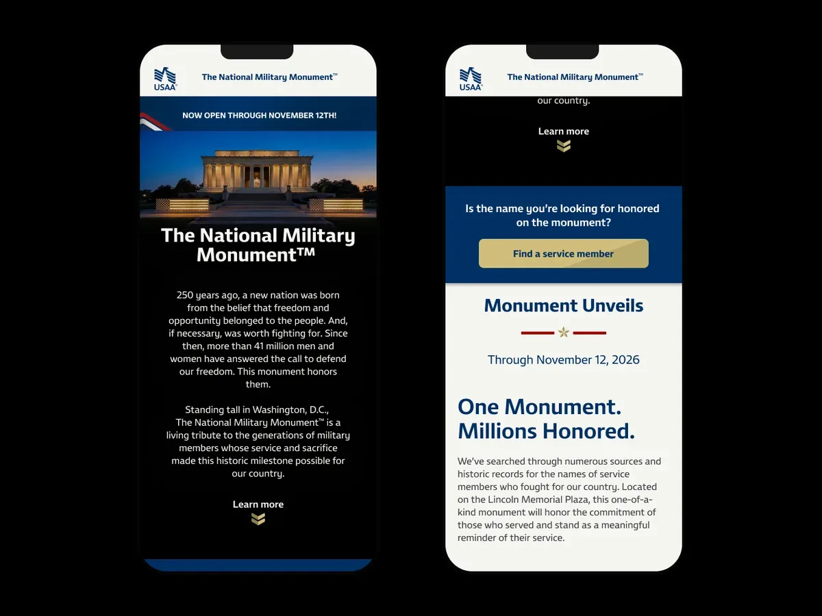
On mobile the same ask becomes a blue band with one button, placed right after the hero copy.
Challenge
USAA's campaign honoring 250 years of military service connected a physical monument with a searchable website. Visitors could arrive remotely or scan a QR code on-site. The database held 39.5M records, but gaps meant people might not find a loved one's name during an emotionally important visit.
My decisions
I designed the path from search to name view and tribute sharing, including a route to submit a missing name for review. The mobile screens explain the limits of public records and confirm that submissions require review before display.
I also specified the LED display's name-fitting and hyphen-break rules. Registration and error states went through deliberate client review because the public visibility and emotional stakes required particular care.
Outcome
Site reporting recorded 2.2M search starts, 2.6M name views, and 548K shared tributes. The registration flow added 281K names to the database.
The broader A250 campaign generated 1.86B earned media impressions and received Good Morning America coverage. I later used this work in a Creative Agility talk for Razorfish interns.
01Monument landing page02On mobile the same ask becomes a blue band with one button, placed right after the hero copy.03Honest framing for a database with gaps. The page says up front that the record is incomplete and still growing.04Live search view at monument250.usaa360.com. Four fields, forgiving guidance on name variants, and a single clear CTA.05Live result view. A search hit becomes a tribute card, with a Displayed on the monument badge and two CTAs for sharing and viewing on-site.06Mobile search and submission states explain the limits of public records and confirm that a missing name will be reviewed before appearing on the monument.07Three journeys ran on the same system. At-home search, on-site QR at the plinth, and sharing out from both.08Three core asks09Site evolution
Design systemsPilot complete · rollout by brand
A shared component system and production workflow that still allowed each campaign to vary.
My roleExperience design lead, Knak proof of concept
The pilot finished ahead of schedule and became the basis for a rollout by brand.
My contribution
Translated Figma components into Knak and defined campaign taxonomy, naming, permissions, and the production handoff.
Team leadership
Partnered with Knak on the pilot and shaped a shared workflow for cards, banking, and insurance.
Component library
Challenge
Cards, banking, and insurance ran their own campaign variations without a shared system. Email development and deployment took 19 or more business days after creative handoff, with eight or more teams involved. The system needed to support consistent production while preserving each business unit's campaign needs.
My decisions
I worked directly with Knak to translate the Figma components into a no-code authoring workflow. I defined where design work ended, where assembly and review began, and what downstream campaign teams needed from the handoff.
I organized variations by business unit and tied the naming hierarchy to user rules and permissions. This went beyond folder structure: teams needed to know which components they could use, how campaigns were named, and who could work in each area.
Outcome
The pilot finished ahead of schedule. The team then moved into a rollout of campaign assets by brand, reusing and extending the components. The taxonomy developed into a future-state model with a refined component set, campaign naming conventions, and permissions for each business unit.
View all project visuals8 slides
01Starting baseline after creative handoff: 19+ business days and 8+ teams. The 70% reduction shown here is the pilot target.02Trial, pilot, rollout. We proved the system in parallel while building the component library behind it.03Figma supplied the components; Knak supported no-code assembly, review, and deployment.04Knak review workflow05Component library06Offer components07Drop-in components08Headline components
CRM experience strategyJourney model delivered
Mapped 90 days of onboarding and cross-sell messages so three business units could coordinate member contact.
My roleExperience design lead, member journey
The journey prototype aligned stakeholders on cadence and became the handoff for Salesforce configuration.
My contribution
Partnered with the strategy lead to evaluate email best practices for lead acquisition and managed the UX lead in rebuilding future CRM journeys as interactive Figma artifacts.
Team leadership
Managed the UX lead and aligned stakeholders on journey touchpoints and recommended content types to support Salesforce configuration.
The 90-day journey prototype made message timing and sequencing visible for stakeholder review before Salesforce configuration.
Challenge
New registrants could receive a bundle offer before absorbing their first product, while cards, banking, and insurance competed for attention in the same inbox. The landing pages also lacked a shared structure connecting campaign promises to the next step, alongside high bounce rates and rising paid media costs.
My decisions
With the strategy lead, I evaluated email best-practice patterns for lead acquisition, including content strategy and component types informed by the media activation strategy.
I steered the team to use interactive Figma prototypes of the future-state 90-day journey to communicate recommendations to the implementation team. These artifacts helped align stakeholders on journey touchpoints and recommended content types for Salesforce configuration.
Outcome
The prototype became the client handoff for Salesforce configuration. It let stakeholders decide sequencing with the full lifecycle in view, while the landing-page audit supplied a shared brief for the components and content that email would lead members toward.
01We audited the full ecosystem that email was driving to, from paid channels through landing pages into the quote flow.02Search users are transactional. Social users are not. The category was treating both the same.03Heatmaps showed the fold was doing most of the work. We designed the top of every page for that.04The opportunity was structural. One governance model for which components appear on which pages.05The matrix tied UX themes to personas and funnel stage, so each email touchpoint had a clear content goal downstream.06Aggregate comms data07The 90-day journey prototype made message timing and sequencing visible for stakeholder review before Salesforce configuration.
Five years across digital strategy, AEM migration, shared navigation, and OnDemand growth, including the Marker genetics launch.
Experience strategyAudit delivered
Compared Pixel with competing testing options across the full customer journey in two weeks.
My roleExperience design lead, team of four UX researchers
The recommendations informed a later OnDemand redesign and a broader Labcorp engagement.
My contribution
Set the audit framework, designed and presented the CMO readout, and partnered with the SEO lead.
Team leadership
Coordinated four UX researchers and calibrated their competitive reviews against one journey and criteria matrix.
Journey time comparison
Challenge
At the end of 2020, Labcorp's new CMO wanted a clear view of Pixel's at-home COVID test against a fast-growing market. We had two weeks to assess the full experience and present recommendations before further product investment.
My decisions
I established one journey from the initial trigger through discovery, purchase, fulfillment, testing, results, and re-marketing. Each stage had testable criteria so the four audit streams could be compared consistently.
The competitive set included paid at-home kits, free drive-thru options, and other at-home services such as Everlywell and 23andMe. I coordinated the reviews, partnered with the SEO lead, and presented recommendations directly to the CMO. The recommendations addressed account creation, guest access, forms, consistency across channels, and clearer expectations before purchase.
Outcome
The engagement led to further work on Labcorp.com and campaigns. The later OnDemand redesign adopted a majority of the audit recommendations. The work also helped establish the broader relationship that continued through the AEM migration, shared navigation, and future-vision projects.
View all project visuals10 slides
01The ask the CMO gave us. Heuristic plus competitive, across the full journey, not just the product page.02Three competitive buckets. In-category paid kits, free drive-thru, and best-in-class at-home kits like Everlywell and 23andMe.03One holistic journey covering trigger, discover, evaluate, purchase, fulfillment, test and return, results, and re-market. Every UXer calibrated to the same frame.04The criteria matrix. Each phase had a set of testable questions so the four audit streams could compare without drift.05Full journey site map06We opened the audit with the trigger question. What actually brings someone to buy an at-home COVID kit, before the brand gets a chance to speak.07Journey time comparison08Recommendations for immediate UX improvements across account access, forms, product information, and purchase flow.09Thoughtful content findings10Streamline page flow
Design systemsAEM migration shipped
Extended a new brand into reusable AEM templates across Labcorp.com and its first business-unit sites.
My roleExperience design director, .com and business-unit sites
The homepage and first business-unit sites moved to AEM with a shared design system.
My contribution
Mapped the digital ecosystem and co-led the extended design system and AEM template work.
Team leadership
Aligned migration priorities with executives and oversaw design handoffs and reviews with Labcorp and its brand agency.
The ecosystem map made migration scope visible across diagnostics and drug development, with properties sized by traffic.
Challenge
Labcorp was moving its main site to AEM while introducing a new brand identity. The homepage, oncology, women's health, and other business-unit sites needed a shared system that could flex across audiences and provide a model for the wider migration.
My decisions
I mapped the diagnostics and drug-development ecosystem so stakeholders could see the scope, traffic, and relationship of their properties. I co-led the design-system work and template prioritization, then oversaw handoffs and reviews against the shared components.
The system had to support different needs within a single site. Oncology served providers, pharma partners, and patients, while its test menu focused on providers searching a catalog of more than 550 tests by cancer type, disease, and technology. I helped establish reuse rules so business units could extend the system consistently.
Outcome
Labcorp.com moved to AEM with shared components behind the homepage and the first business-unit sites. The template library became a working model for the rest of the migration. It also provided the design foundation for the shared navigation work that followed.
A directory that pulls up each site's home page. A little buggy.
View all project visuals10 slides
01Stage one. The two core sites carrying almost all the traffic, Labcorp.com and DrugDevelopment.labcorp.com.02Stage two. Core sites on subdomains. The portals and jobs properties that still had to roll up to one Labcorp story.03The ecosystem map made migration scope visible across diagnostics and drug development, with properties sized by traffic.04Oncology, one of the business unit sites that got the new brand on the extended .com design system in AEM.05Oncology site header and test search06Oncology test menu, mobile07Testing services by cancer type08Homepage type tester, desktop and mobile09Mobile hero layout recommendation10Labcorp design library
Information architectureShipped on Labcorp.com
Brought four audiences and about 40 sites into a shared navigation approach through research and stakeholder alignment.
My roleExperience design director, information architecture and navigation
Unified navigation shipped to Labcorp.com and informed the One Labcorp plan.
My contribution
Co-led research and shaped a shared navigation structure and taxonomy.
Team leadership
Ran workshops with patient, provider, and pharma stakeholders, using findings to resolve labels and hierarchy.
Usability testing overview
Challenge
About 40 sites and more than 40 headers served patients, healthcare professionals, biopharma, and employers. Labcorp had a shared design system in AEM but no consistent way into the ecosystem. OnDemand was also difficult to find from the main site.
My decisions
I co-led 31 rounds of research, including card sorts and concept tests, and used the findings in stakeholder workshops. Testing supported disease and specialty terms as useful directory labels and showed where broader terms needed refinement.
The shared structure used four audience hubs, three content pillars, and quick links. This gave routine tasks and the OnDemand store a more visible place in navigation while supporting different audience needs.
Outcome
The unified navigation shipped to Labcorp.com. In the patient study's Billing & Insurance task shown above, all 16 participants found the destination, with a median time of 21 seconds. Those results describe that specific tested task.
The architecture informed the One Labcorp plan: four audience site maps, about 35 topic maps, and a shared data layer, with a planned 12-to-18-month build across 30 to 40 sections. It also informed the connected-health future vision.
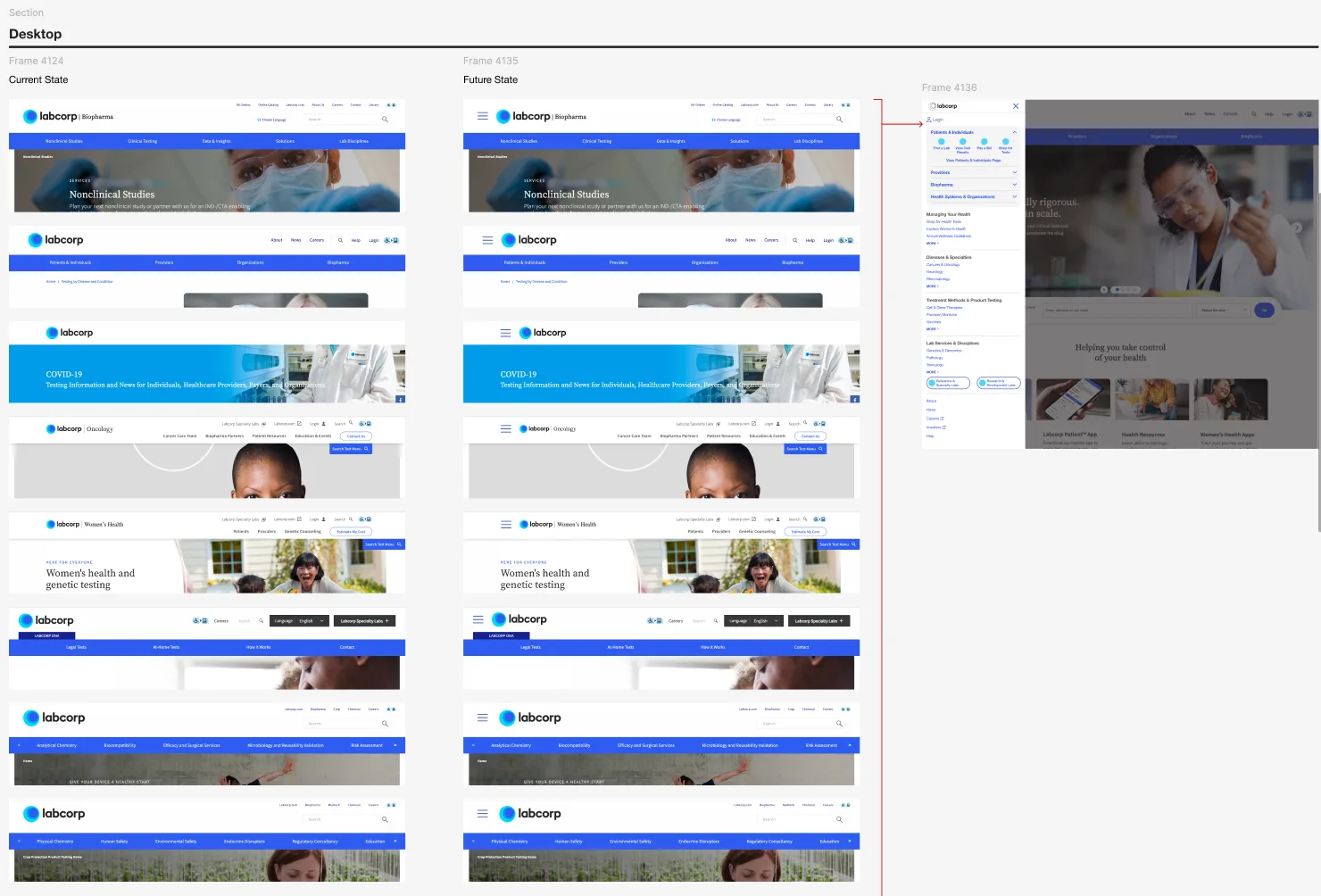
01Innovation territories02Primary objectives matrix03The target information architecture. Four audiences, three content pillars, and the quick links that stitch them to the specialty pages.04Unified site experience flow05Future state. Audience site maps on one side, topic site maps on the other, with a shared data layer stitching them together.06The crossover problem. One topic like Neurology spans several audiences and several labs, so the IA had to let them co-exist.07Future-state content concept: a Colorectal Cancer page with audience-specific headlines, copy, CTAs, and imagery.08Global nav menu wireframes and annotations09Mobile global nav. The audience hub pattern repeated at phone width so the switch between patient, provider, and pharma stayed one tap away.10Menu content by audience11Current and proposed headers show how a shared navigation could connect the existing sites.12Usability testing overview13Card-sort findings supported disease and specialty labels while identifying broad terms that needed further refinement.14Patient usability study, Task 2: all 16 participants found Billing & Insurance, with a median time of 21 seconds. This result is specific to that task.15Navigation vs search preference, providers16Main menu findings
New product launchMarker launched · growth strategy delivered
Connected the Marker genetics launch to a broader OnDemand wellness strategy.
My roleExperience design lead, OnDemand growth and Marker
Marker launched on OnDemand, with a shared journey direction for future wellness products.
My contribution
Shaped the CMO growth narrative and directed the Marker landing page, four-step journey, and content strategy.
Team leadership
Set a shared journey pattern for future products, connecting wellness needs, lab results, profiles, and coaching.
Growth concept: goal-based onboarding offers guidance beyond a flat test catalog.
Challenge
The CMO wanted to extend OnDemand from a test store into a connected wellness experience. Marker, a 163-gene consumer genetic test, needed to fit that direction while explaining its value and process clearly.
My decisions
I developed the growth narrative around two wellness personas and their pre-visit, during-visit, and post-visit journeys. For Marker, I directed the landing page and four-step path from ordering through sample collection to counselor guidance.
I split the story between the landing and product-detail pages and mapped messages to components for stakeholder alignment. Existing OnDemand components supported the Marker design. The growth concepts explored guidance, profile integration, and coaching as future extensions.
Outcome
Marker launched as Labcorp's first direct-to-consumer genetic test on OnDemand.
The wider OnDemand relaunch moved commerce to AEM and Adobe Commerce, with 24 reusable components and 13 rounds of usability research. Work with the Patient Portal team reduced separate-account needs. Platform reporting after that relaunch showed 16% month-over-month test-revenue growth, 36% more site visits, 382% more visits from Go Test Yourself paid tactics, and nearly one in five orders containing multiple products. These are results for the broader OnDemand platform.
The June 2026 journey work supported the CMO's executive growth presentation on wellness content, lab-result integration, and coaching.
01The brand and revenue case for the journey work, framed as one opportunity.02The working session board behind the CMO growth journey, Brenda and Julian mapped step by step across the full visit.03The Health Seeker persona, Julian, built for the OnDemand growth journey work.04Pre-visit journey, stages 1 to 3. From a social post to a booked appointment.05Growth concept: goal-based onboarding offers guidance beyond a flat test catalog.06During-visit journey, stages 4 to 6. The PSC visit and first look at results.07Future journey concept: guidance connects results to lifestyle changes and a possible OnDemand subscription.08Future opportunity: explore exporting results into Claude to support a personal plan.09The OnDemand component library we drew from to speed up the Marker page design, leaning on its newer components.
Product strategy and an AI roadmap for Compass, the media platform used by hotel teams. Delivered to Marriott in January 2025.
Product strategyRoadmap and concepts delivered
Reframed hotel campaign planning around business goals and translated the UX and AI direction into a staged roadmap.
My roleExperience design lead, Compass UX point of view
A 2025 roadmap and AI concepts supported a model forecasting up to $67M over three years.
My contribution
Co-authored the goal-based media plan, AI direction, and 2025 feature priorities.
Team leadership
Connected strategy, UX, and content work with Koddi's platform constraints and Marriott's roadmap needs.
Inspired by NotebookLM, the team used ElevenLabs to prototype a personalized hotel-performance report as a concept for improving Compass adoption.
Challenge
Compass served individual hoteliers and teams managing twenty or more properties. Insights were buried, and campaign creation demanded channel decisions before business goals. The existing platform drove more than $2B in revenue in 2024, so a new roadmap had to work within Koddi's stack without disrupting service.
My decisions
I put the business goal first in the media-plan concept, guided by transparent automation, a simpler multi-channel workflow, and insights in context. With a colleague, I translated priorities into feature cards with activities, deliverables, assumptions, and dependencies across a four-quarter plan.
The roadmap covered campaign planning, multi-hotel management, automated insights, reporting, training, and projections. I defined a front-end AI direction with contextual recommendations, natural-language questions, and a personalized audio report. An engagement score concept made adoption visible while keeping the hotelier in control.
Status
Marriott received the roadmap in January 2025, with feature cards for sprint planning and concrete UI and audio-report concepts.
The associated pro forma forecast revenue growth of up to $67M over three years, including up to $7.5M from the MVP. These figures are modelled forecasts; the delivered work was the roadmap, valuation model, and concepts.
View all project visuals7 slides + 1 video
01Campaign creation reframed around a business goal, step by step.02Campaign-creation concept: hotel context and a recommended budget give the hotelier a starting point before channel decisions.03Multi-Hotel Enhancements for bulk users running twenty-plus properties.04Automated Insights Enhancements tying recommendations to goals, channels, and audience data.05Ask questions users want to know. A People-Also-Ask pattern on the dashboard.06Audio-report concept: a personalized summary offers another way to understand a dense monthly email.07Inspired by NotebookLM, the team used ElevenLabs to prototype a personalized hotel-performance report as a concept for improving Compass adoption.08AI use cases, front end and back end, as sent to Marriott.
An AI-assisted dealer delivery concept that led to a request for extension across sister brands, including Genesis.
AI service designPitch concept · extension requested
Defined where AI could assist vehicle delivery and where the dealer should stay in control.
My roleExperience design pitch lead
Hyundai requested an extension across its sister brands, including Genesis.
My contribution
Defined the AI-system vision, the three delivery moments, and the roles of the dealer, customer, and AI.
Team leadership
Directed the UX lead who refined the branded screens and built the prototype used in the pitch.
Dealer interface concept showing task recognition, live transcription, suggested next topics, and dealer confirmation.
Challenge
A vehicle handoff combines owner education, feature demonstrations, required checks, and documentation. Hyundai needed a concept showing how AI could reduce that workload while preserving the interaction between the dealer and customer.
My decisions
I grounded the concept in the existing delivery checklist and summary. I framed AI as an ambient copilot across pre-delivery, handoff, and post-delivery, then defined where it could suggest help and where the dealer would confirm or take over.
The functional model connected the dealer and customer experiences and supported the business goal of richer CRM understanding. I set the vision and experience narrative, then worked through my UX lead, who refined the three moments inside the design system and built the pitch prototype.
Status
Hyundai asked the team to extend the solution across its sister brands, including Genesis. The pitch also produced a reusable method for AI exploration and a functional model for coordinating the dealer, customer, and system.
View all project visuals6 slides
01The existing checklist created administrative work during delivery and was used inconsistently across dealers.02System vision for an AI copilot across the dealer and customer workflow.03The delivery journey from the dealer and customer perspectives.04Dealer interface concept showing task recognition, live transcription, suggested next topics, and dealer confirmation.05Dealer-side interface inside the delivery concept.06Pre-delivery, handoff, and post-delivery as one connected concept.